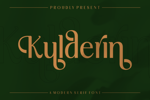
Kulderin: A Modern Display Font for Digital Brand Identity
As a UI designer who ships dozens of landing pages, SaaS dashboards, and e-commerce experiences each year, I pay close attention to how typography shapes perception before the first word is read. Kulderin stands out—not as background filler, but as intentional visual punctuation. It’s a display font built for moments that demand presence: hero headers, logo lockups, premium product banners, and editorial accents where elegance must be felt instantly.
Visually, Kulderin balances modern geometry with subtle organic rhythm. Its letterforms feature clean terminals, confident stroke contrast, and a refined sense of spacing—never cramped, never sprawling. Unlike overly ornate script fonts or rigid geometric sans serifs, Kulderin carries quiet confidence. It reads as luxurious without being elitist, contemporary without sacrificing warmth. That duality makes it unusually versatile across digital contexts—from a minimalist coaching website’s headline to a boutique apparel store’s Instagram carousel overlay.
In practice, Kulderin thrives in high-impact, low-volume roles. Use it for hero section titles, section headers, logo text, and short branded quotes. Avoid body copy, navigation labels, or small CTAs—it’s not designed for extended reading or tight UI constraints. On mobile, reserve Kulderin for above-the-fold headlines only; scale it generously (48px minimum on desktop, 36px on mobile) and pair it with generous line-height and letter-spacing to preserve legibility against image backgrounds or gradient overlays.
For conversion-focused layouts, Kulderin strengthens hierarchy by signaling importance through typographic contrast. When placed beside a neutral sans serif like Inter, Poppins, or Manrope, it creates immediate visual separation—guiding the eye directly to your value proposition or CTA. Think: “Elevate Your Style” in Kulderin over a muted product shot, followed by crisp, scannable benefit bullets in a lightweight sans serif. That contrast isn’t decorative—it’s functional. It reduces cognitive load by clarifying what’s primary, secondary, and tertiary.
Brand tone translates directly through Kulderin’s execution. A fintech startup might use it sparingly for its “Trust Report” section header—implying authority and polish. A ceramicist’s online shop could set “Hand-Thrown | Small Batch” in Kulderin across a hero banner, reinforcing craftsmanship and intentionality. Even in dark-mode interfaces, Kulderin holds up well: its open counters and balanced weight distribution prevent visual sinking on charcoal or navy backgrounds—just ensure sufficient contrast (at least 4.5:1 against dark surfaces).
Pairing Kulderin thoughtfully is non-negotiable. For web interfaces, combine it with a highly readable, variable sans serif for all interface text—navigation, buttons, form fields, and paragraph copy. Inter or Recursive work exceptionally well: their optical sizing and responsive hinting adapt cleanly across devices. If your brand leans editorial—say, a design blog or creative course platform—consider pairing Kulderin with a refined serif like Literata or Crimson Pro for long-form content, letting the display font anchor headings while the serif supports sustained reading.
Check what’s included before licensing. Kulderin typically ships in WOFF2 and WOFF formats—ideal for fast-loading web delivery—and often includes stylistic alternates (like swash capitals or ligature options) that add nuance to logo variations or social media graphics. Confirm multilingual support if your audience spans European languages; most professional display fonts cover Latin-1 and basic Latin Extended-A, but Cyrillic or Greek may require verification. Also note: Kulderin is a premium font. Its commercial license covers web embedding via @font-face, usage in client websites, SaaS platforms, digital templates, and online store branding—as long as you’re using it within the scope defined by the foundry. Never self-host or redistribute font files outside licensed domains.
Real-world examples show its impact: A wellness coach uses Kulderin for “Your Calm Starts Here” in her hero banner, then switches to a warm, airy sans serif for session descriptions—creating calm through contrast, not clutter. A sustainable skincare brand sets its “Plant-Powered • Dermatologist-Tested” tagline in Kulderin over soft-focus ingredient photography, reinforcing premium positioning without explicit claims. A digital course marketplace applies Kulderin only to course category headers (“Design Systems”, “UI Animation”, “Accessibility First”)—making navigation feel curated, not crowded.
Readability on small screens demands discipline. Never force Kulderin into a 14px button label—even with bold weight, it loses clarity. Instead, use it for the headline above the CTA (“Join the Waitlist”), then rely on a robust sans serif for the button itself (“Get Early Access”). On image overlays, apply subtle text shadows or semi-transparent background bars only when necessary; Kulderin’s strong letterforms usually need minimal enhancement. And always test at 300% zoom on mobile: if spacing collapses or characters touch, increase tracking or reduce size.
Ultimately, Kulderin isn’t about decoration—it’s about strategic emphasis. In an ecosystem saturated with generic system fonts and overused Google Fonts, choosing Kulderin signals intentionality. It tells users, clients, and collaborators that your digital experience was crafted, not assembled. That impression compounds: stronger visual hierarchy improves scanning, clearer brand voice builds trust, and consistent typographic choices across pages, emails, and ads reinforce recognition—without relying on logos alone.
If you’re refining a portfolio site, launching a direct-to-consumer brand, or redesigning a course sales funnel, Kulderin earns its place not as a flourish, but as a functional design decision—one that aligns aesthetic precision with digital usability.